ITEM No. 3
INIT · SELF-DIRECTED CONCEPT
KEPT FOR THE CRAFT AND THE PROCESS. NOTHING ON THIS PAGE IS A MEASURED OUTCOME.
THANK YOU FOR LOOKING CLOSELY
Item No. 3 · Init · Self-directed concept, 2021
An end-to-end iOS app for meeting people nearby
A concept project, not client work. Designed during the pandemic, when branching out of a small circle had gotten harder and less safe to do.
Role
Solo product designer, concept project
Stack
Figma, Marvel prototyping
Scope
Research, personas, flows, hi-fi UI, usability testing, prototype
Method
Self-directed, never shipped
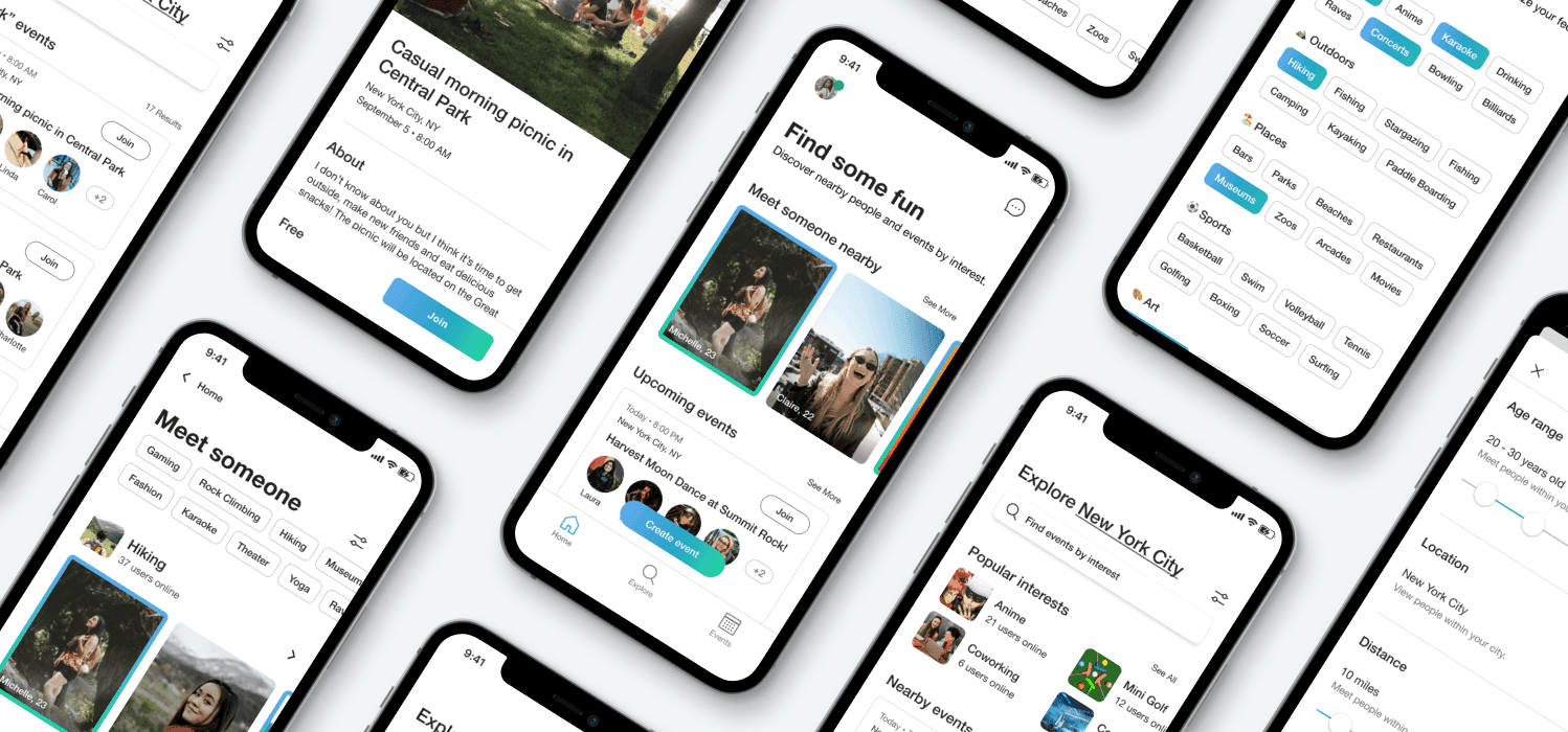
Init is an end-to-end iOS app designed to help people meet others nearby through video chat and local events. I ran the full process solo, market research through a clickable hi-fi prototype. It is kept in this portfolio for the craft and process it shows, not as evidence of a shipped, measured business outcome.
No delta to report, and none is claimed. Every other case study on this site carries measured outcomes; this one is here for the thinking.
Line 01
The problem: harder to branch out, and less safe to do it
The app connects users to nearby people and upcoming local events, letting people browse profiles and events by shared interests, and create or join events directly, with video chat as the core way to meet before meeting up in person.
Line 02
Grounding it in research before designing anything
Competitor analysis looked at Meetup (event creation and attendance), Nextdoor (neighbour-to-neighbour connection), and Bumble BFF (friend-finding), placing Init against both spaces rather than assuming it competed with just one. Secondary research shaped the direction early: Tinder and Bumble's primary age group is 18 to 29, in 2021 Meetup's top-searched word was "friends," and knowing just six neighbours measurably reduces loneliness.
From there I sketched three kinds of people to interview: the Newcomer, exploring a new area and looking to make friends with similar interests; the Zoomer, wanting to experience their city more deeply; and the Busy Professional, interested in networking and expanding their skills.
Line 03
What I heard from users
Three takeaways from interviews shaped everything downstream. Cater to quick meetups: three of six participants who had moved or travelled to a new area wanted to meet people there right away. Avoid false first impressions: four of six participants said talking to people online was not a good indicator of what they would be like in person. Show people based on similar interests: five of six participants factored shared interests into who they chose to connect with.
Line 04
Framing the problem around one person
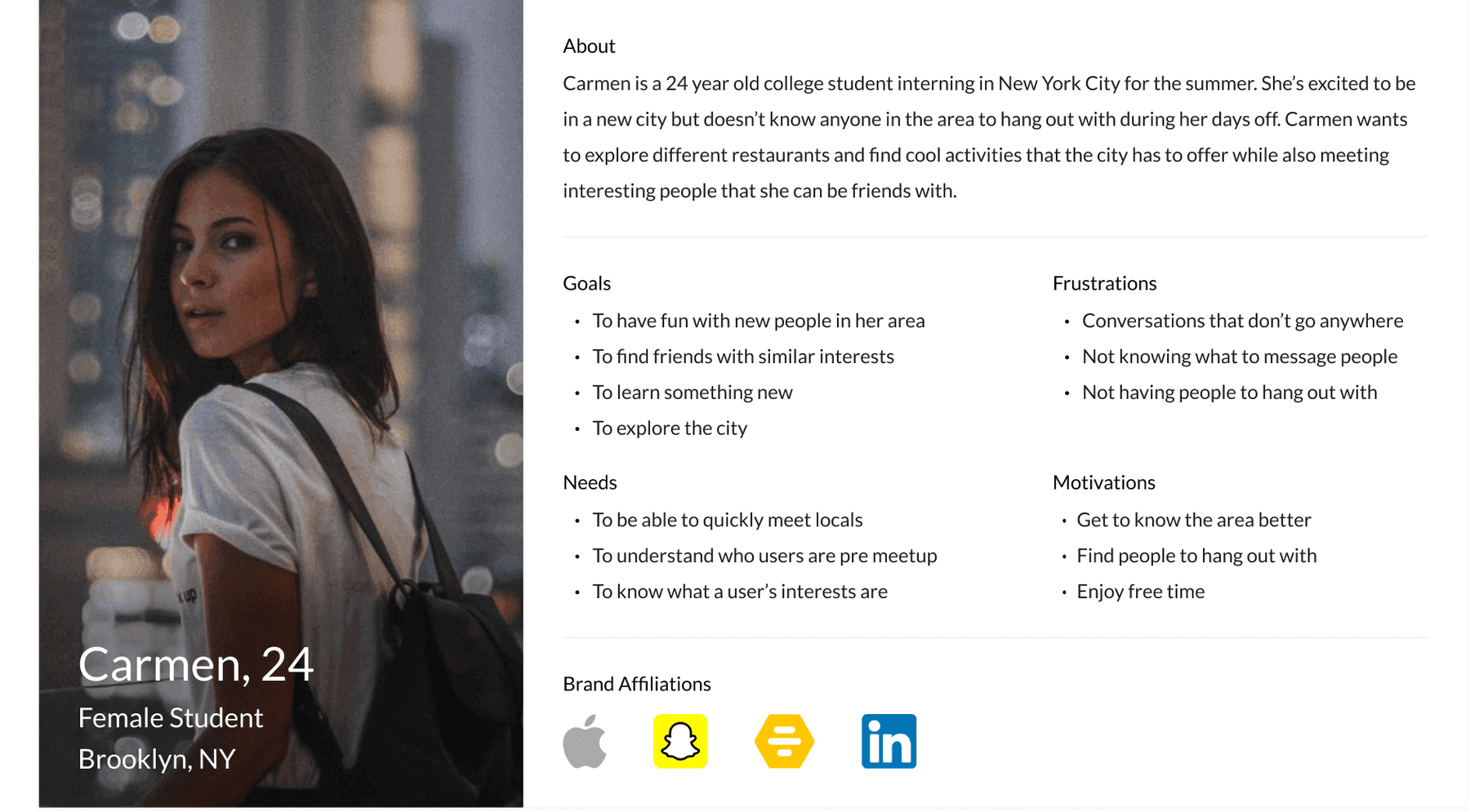
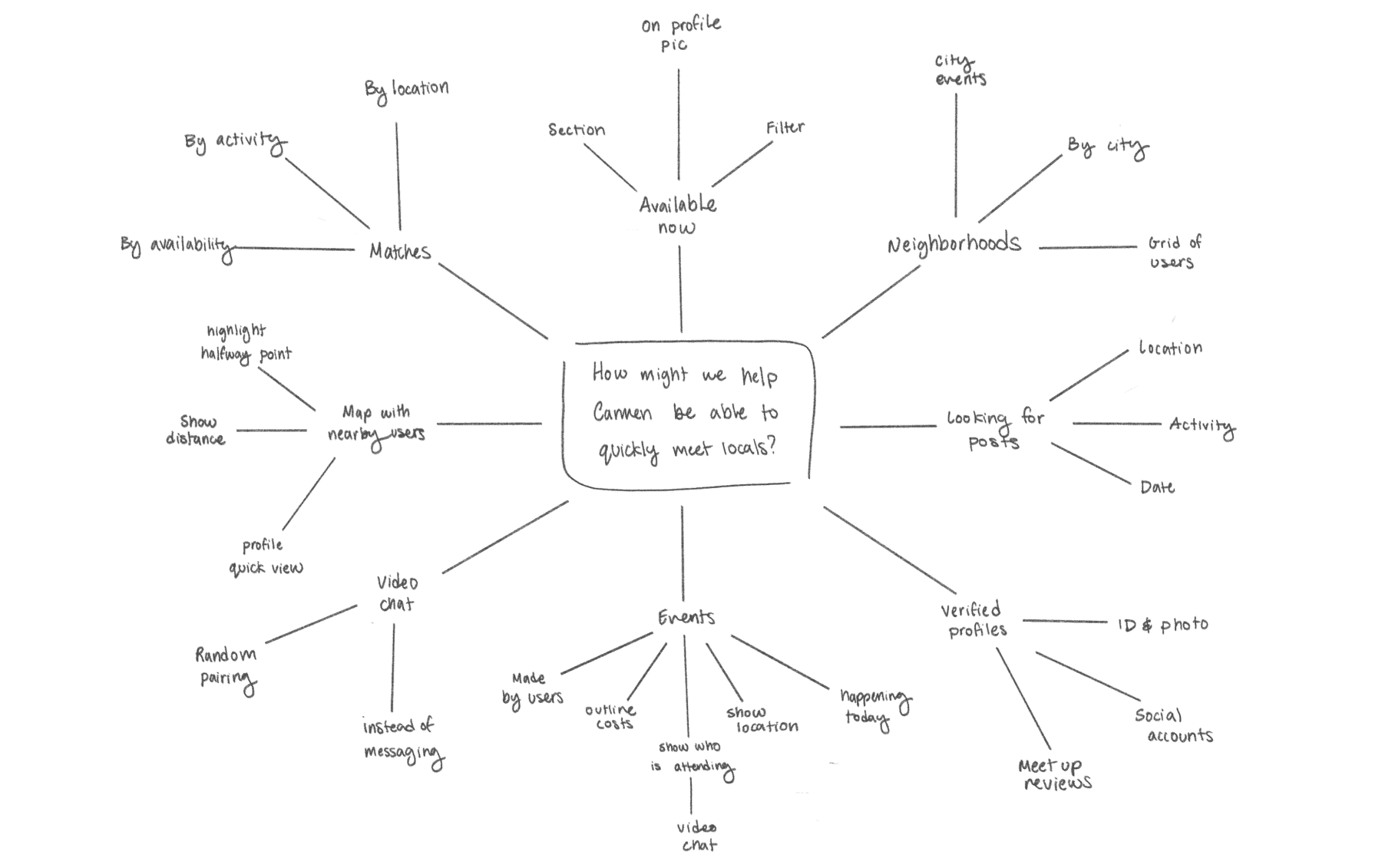
Research converged on one person to design for: Carmen, a 24-year-old college student interning in a new city for the summer, who does not know anyone in the area and wants to explore it while meeting people with similar interests. Her needs became three design questions: help Carmen quickly meet locals, help her understand other users before meeting up, and help her know what they are interested in.
Line 05
From brainstorm to structure
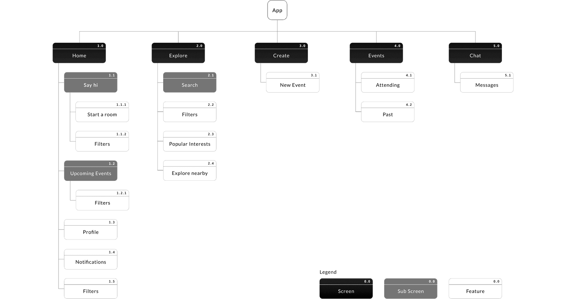
I brainstormed against those three questions directly, then narrowed the results against both business and user goals, so the app map reflected what research had validated rather than what seemed interesting to build.
Line 06
Sketches, then a design system
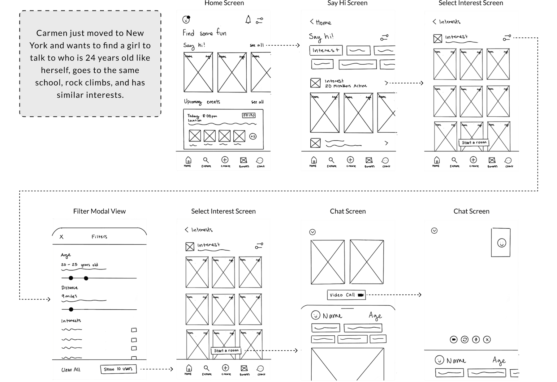
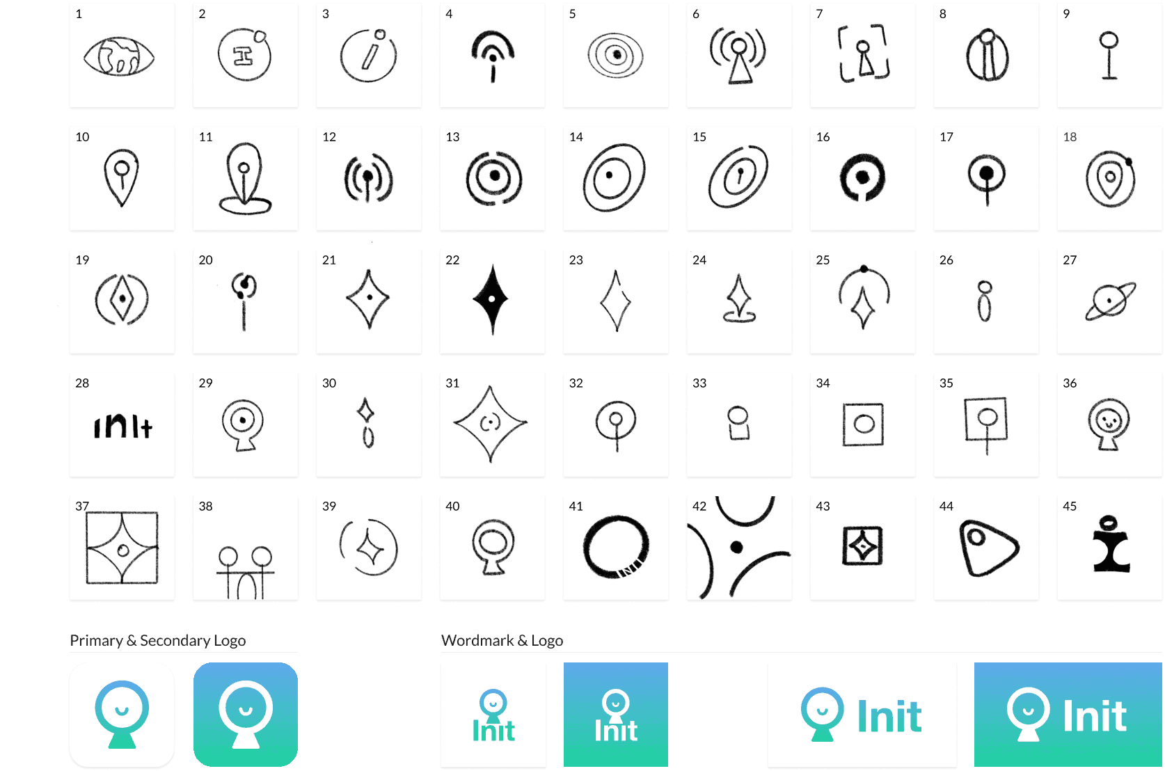
Low-fidelity wireframes let me test the core flow, Carmen tapping "Say hi," selecting an interest, and starting a video chat, before investing in visual design. In parallel I defined Init's brand attributes (natural, infinite, friendly, adventurous, fun, simple, modern) and built a moodboard to guide font, colour, logo, and image choices. The name itself was chosen to keep users feeling like active participants rather than passive browsers.
Line 07
Hi-fi, tested, and refined
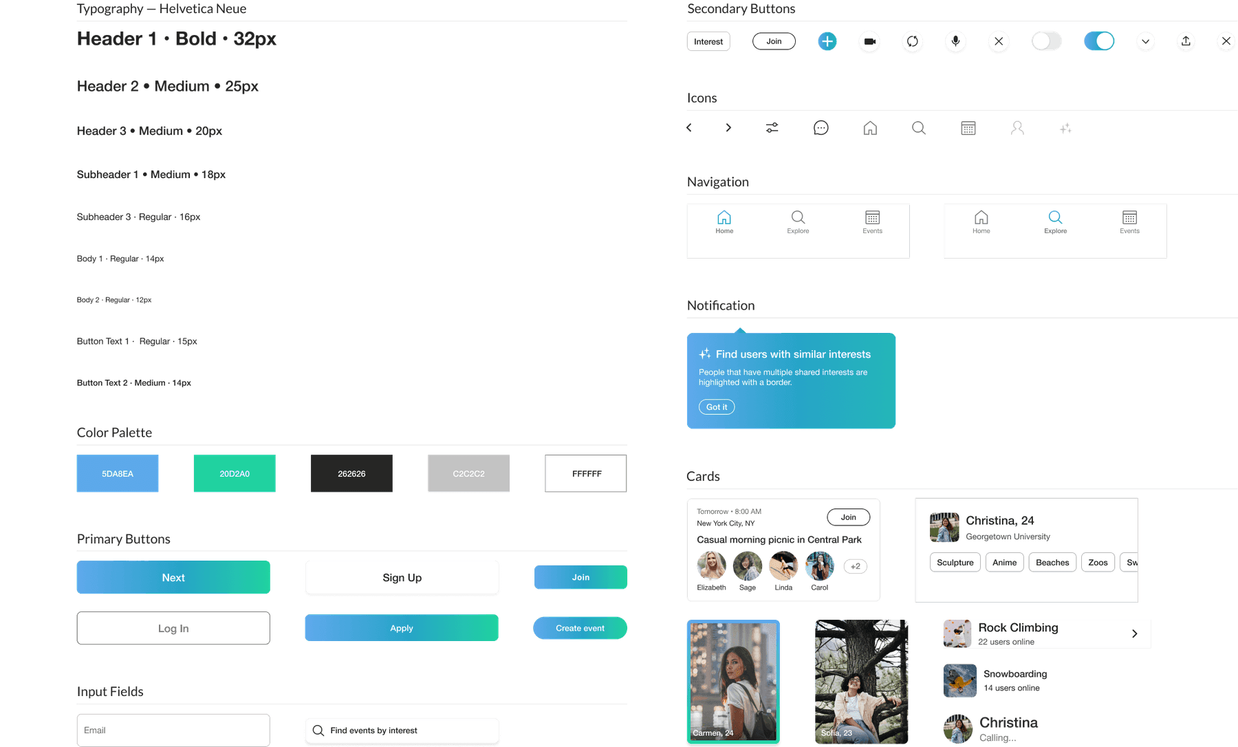
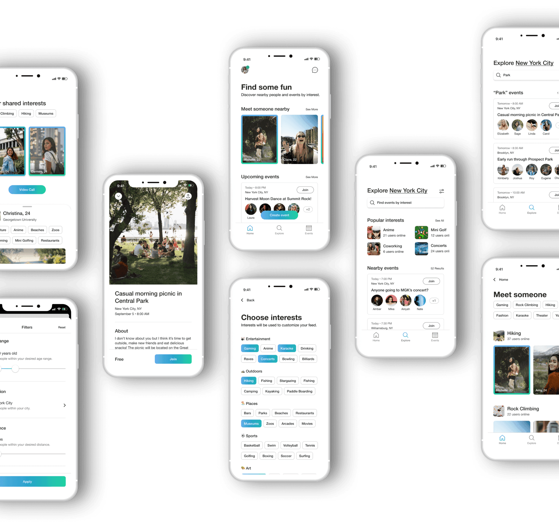
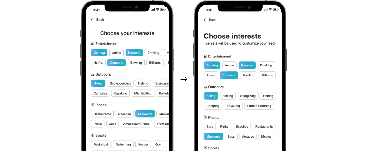
I moved to usability testing with high-fidelity wireframes rather than mid-fidelity, specifically to test the new design system (colour, typography, imagery, cards, buttons) with real users rather than test layout alone. Feedback from that round shaped the final screens: "Choosing interests" was reworked to minimise horizontal scrolling and add more context per option, and the main feed was updated with more insightful headings and a more modern treatment of event cards.
Line 08
Choosing video calling as the core mechanic
This was the one place the moderated part of testing mattered most. If the sessions had not been moderated, I would not have seen each participant's face when asked to start a video call: despite saying it was weird, their expressions showed nervous excitement, not reluctance. That behavioural signal, not the verbal one, is why video calling stayed the app's primary way to connect instead of adding text messaging.
What it cost
Almost every participant said the lack of messaging felt weird when asked directly. I kept video-first anyway, trusting what their expressions showed over what they said.
Line 09
What is next
Init was handed off to a developer using Figma. Open questions for a real build: how users actually use video chat once it is live, whether they need an incentive to make their first call, and lower-priority features like verified profiles.
Line 10
What I learned
Keep features to a minimum: fully-featured social apps carry a lot of surface area, and simplifying to an MVP took real, deliberate thought about what made Init different from the apps it was competing with.
Prioritise moderated usability tests: the video-calling decision above only held up because the sessions were moderated. An unmoderated test would have only captured "this is weird," and missed the expression that said otherwise.
Onboarding 100K new users a month, 20% better