ITEM No. 1
WEEDMAPS · ONBOARDING FUNNEL
RELATIVE DELTAS. THE ABSOLUTE BASELINES ARE THE COMPANY'S. THE MOVEMENT IS MINE TO SHARE.
THANK YOU FOR LOOKING CLOSELY
Item No. 1 · Weedmaps · Conversion and growth
Onboarding 100K new users a month, 20% better
The largest cannabis marketplace had its biggest conversion problem at the front door: high intent, no vocabulary, and a bounce before the first purchase.
Role
Lead product designer, Conversion and Growth
Surfaces
Web, iOS, Android
Scope
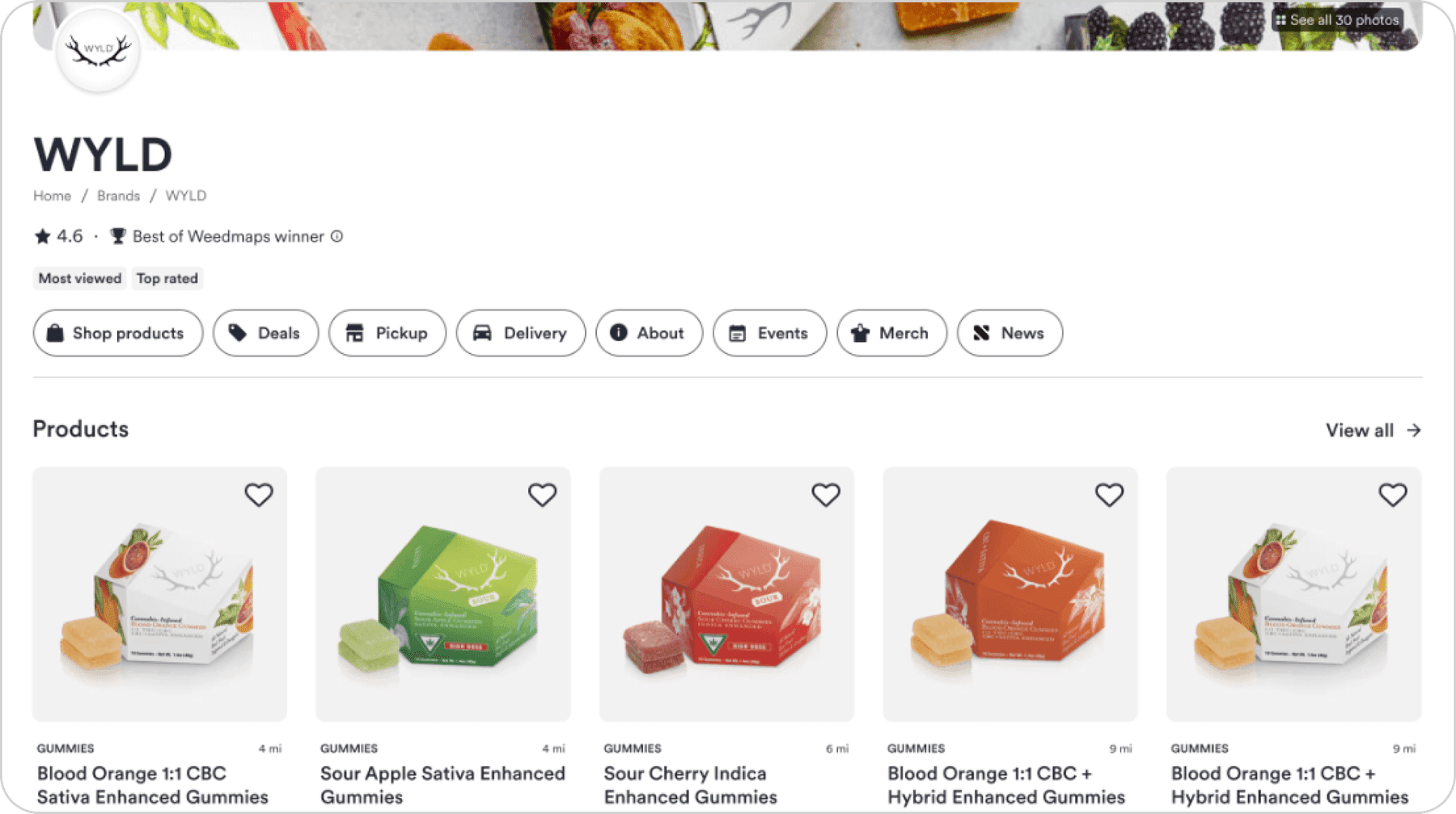
Onboarding funnel and brand page consolidation
Method
Shipped behind A/B tests with PM, engineering, and data science
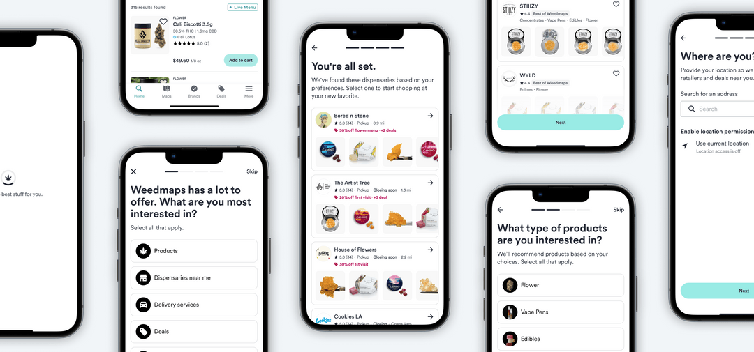
Weedmaps is the largest cannabis marketplace, and 100K+ new users arrived every month with high intent and no vocabulary. I designed a guided onboarding funnel that replaced open browsing with a short preference flow feeding personalized recommendations, then shipped it with PM and engineering through the experimentation program across web and mobile.
Line 01
This is an ecommerce problem, not a cannabis problem
Strip the category away and the shape is familiar to anyone running a DTC funnel: a shopper with zero product vocabulary. The same person who lands on a fragrance, skincare, or fine jewelry site knowing what they want to feel but not what to ask for.
Advertising restrictions meant the platform could not buy its way out with retargeting, so every bounce was expensive and mostly unrecoverable. That is why this was staffed as a conversion initiative, not a delight initiative.
Line 02
Ask about the person, not the product
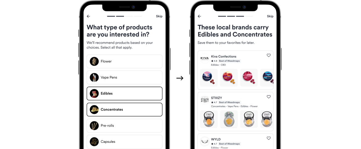
Users who cannot answer "what product do you want?" can answer "how do you want to feel, and how experienced are you?" The flow required zero category knowledge, stayed short, and made each answer visibly narrow the outcome, so it read as progress rather than a form.
“What product do you want?”
A question a first-time visitor structurally cannot answer.
“How do you want to feel?”
Zero category knowledge required.
What it cost
Every added question is friction before value. We were asking newcomers to invest before showing them anything.
Line 03
Funnel to a decision, not a catalog
The recommendations ended at a small, curated set of nearby dispensaries and products instead of dumping users into filtered browse. For a zero-vocabulary user, relevance beats completeness, and the bounce data on open browsing backed it.
What it cost
Showing less risked feeling limited, and it reduced the surface area available for merchandising.
Line 04
Make every answer compound
Onboarding responses fed the affinity models the data science team maintained, so the flow was not just a first-session fix, it was structured preference data improving recommendations platform-wide. This is the decision I would defend as the most senior one: it turned a UX patch into a data asset.
Finding the revenue leaks in a $1M+ jewelry brand's funnel